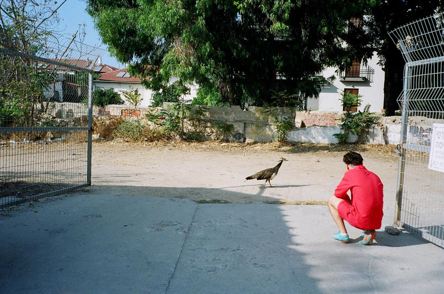
Visual Identity: Meet David Rudnick, the Designer behind Evian Christ, RL Grime and Wil Fry’s Sharp Aesthetics
The UK-born designer provides a rare peak into his subtle design process, his philosophy on nightclubs and how deeply personal a typeface can be.
In his monthly column Visual Identity, Harry Gassel will highlight emerging voices in the ever-shifting worlds of art and design.
Graphic design is a funny thing—it sits on t-shirts and hoodies, it styles album covers, it shapes the page and letterforms of websites and mostly it's meant to go unnoticed. Or rather, the job is ultimately to deliver content, to give form to some other, external message. But then there are designers like David Rudnick to whom these surfaces present an opportunity for a far more personal type of work. Over the past four years Rudnick, a British-born, American-educated, self-taught designer has become a force in music and culture. As artistic director for the Making Time club night in Philadelphia, a collaborator to artists like Evian Christ, and the guy behind the identity for New York streetwear brand Wil Fry, Rudnick applies careful if sometimes esoteric research—he studied art history at Yale University—to projects that could otherwise be satisfied by something that looks cool and of-the-moment. Rudnick sees his platform as a responsibility, an opportunity to lace conscientious meaning into the sometimes crass playing field of commercial images. Like how he embeds a critique of violence in a video for WeDidIt producer RL Grime who makes trap music, a genre that can, at times, overtly glorify violence. And like a good double agent somehow it still manages to look entirely cool and, if not current, then next: the ghost of trends future. Ultimately the work poses the question: if we are going to be so inundated with images, shouldn’t they be good ones? Here Rudnick gives us a rare peak into his subtle design process, his philosophy on nightclubs and how deeply personal a typeface can be.
Where are you from? I was born in northwest London, in a strange little village called Letchmore Heath. It’s close to London, not quite in the suburbs, in a strange little patch of countryside. I went to college in the States, and since then I’ve had one foot in the US and one foot in the UK.
Right, you ended up Yale University, which is an unusual course for an artist from London? I wanted to go to the Ruskin at Oxford University because I wanted to study fine art and philosophy. I felt I couldn’t put aside the part of my life that involved experimenting with visual ideas but at the same time I wanted to ground that in an inquiry into language or history, into the shape of ideas. In England our university education you do a very set program of study—I could do either philosophy or art, but the Ruskin allows you to take other courses in your college. And I just straight up didn’t get in. So I applied to the four American universities I’d heard of.
You were studying art history—how did that translate to graphic design? I wanted there to be a music magazine at Yale. I felt that if we make one it should be good and not be alienating or snobby, and not constrain that type of music by the way it looked. So those became mechanical concerns about how the magazine had to function. And because I felt passionately, I started to think of ways to communicate that. At no point in this process was I saying to myself, “you’re doing graphic design.”
One of your first big projects was posters for the Making Time club night in Philadelphia. What were you trying to do with those? Making Time was an early way of prototyping my relationship to this question of how to be a designer in a world were you know that there are eyes on your work, people looking for structural elements that they can borrow as strategy. The posters go up all around Philadelphia which has campuses for a multinational company that needs to present itself as being aligned with youth trends.
I know the company you're talking about—Urban Outfitters. I realized the posters were essentially part of a rolling mood board for people who saw them. They are designed to create graphic excitement. It became a wonderful place to experiment with new ideas, new typefaces, new ways of structuring information, new color combinations. And because of the rapid turn over of those posters, you can push though ideas faster than the company. By the time they get your shit on a t-shirt, three months later you’ve already shown a stylistic evolution. That for me totally works for the context of a nightclub like Making Time, which is constantly presenting new music and those posters always have to suggest an excitement about the music the club is presenting.
There’s a relationship between that strategy and dance music culture in general, which has a history of premiering trends that are very quickly co-opted. Like the dubplate is printed fast, gets played once in a club, and the record industry might take 6 months, a year, to be able to follow up on it. By that time, the DJ is playing something new. The nightclub for me remains our most powerful and in some ways creative cultural liminal space. Almost all of the operative norms and rules of daylight capitalist democracy are turned on their head once you’re through the door of a truly ambitious nightclub. It’s spatially confusing, dark, it’s without hierarchy, a flat dance floor. When 2000 people in a club have never heard a track and they all hear it together for the first time, that’s a particularly beautiful moment of possibility. The nightclub is this primordial environment where, if done correctly, you can lose the identity of self. It’s the last environment left for us where you are completely at the liberty of being who you want to be, moment to moment.
Is this something you were thinking about going while working on the Evian Christ EP? I wanted to create space without architectural structure or language. The music is extraordinarily beautiful. There are moments in it where the music almost gasps and there is a tremor—it kind of bridges a silence and you are forced to confront the space of the music itself through these kind of violent bursts that echo out into it. I wanted evoke the texture of being in that space. It's actually a heavily manipulated photo where I took my MacBook, tilted it at an angle and sprayed little drops of water onto the screen, taking photos of it and then putting the photo on the screen spraying water onto it again to create this field of non-real water droplets. I then arranged the droplets into patterns that felt like Japanese landscape painting. I wanted there to be a sense that this was a world that you could barely understand but wanted to spend time in.
The inside is the exact opposite, there’s this extremely heavy typography very much grounded in a voice that is speaking directly to the viewer. I felt that I didn’t want to go the cliché of the environment is ambient and now we speak quietly with a soft gallery voice in a nice sans-serif, tastefully. I wanted to do something that was blinding and perverse and strong, and I’d been drawing a black-letter alphabet. The name 'Evian Christ,' it's two words that are just so extraordinarily beautiful—it's this amazing poetic phrase—you want to put those words in a really big clean type. But I buried it under this mass of thorns. It's utterly unrewarding in the ornate form I presented it in, and utterly at odds with modern idea of the phrase.
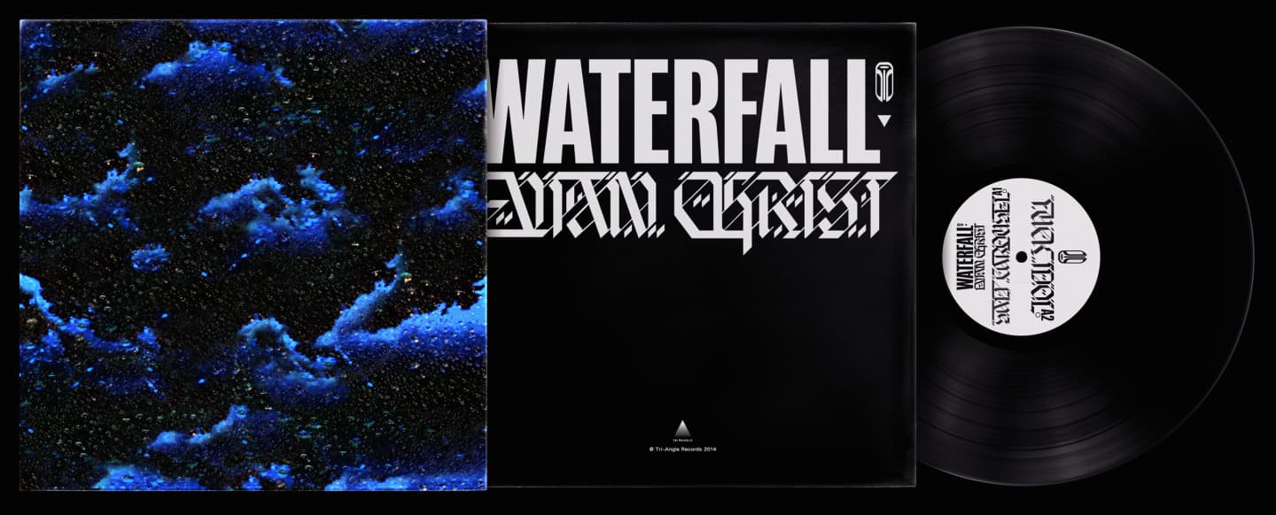
"I wanted there to be a sense that this was a world that you could barely understand but wanted to spend time in."
You draw a lot of your own type. It gives the work a very personal feel. Most of the type I use in my work is stuff I've designed myself. Often I'll design a typeface that's really similar to an existing typeface but the voice is unplaceable. It feels like its almost coming out of a parallel universe, different timeline, an alternate path. Whenever you draw a typeface it takes so much of an investment of drawing time, personal attention. Every curve is gonna be a curve that you preferred. Even in the Obama “Hope” poster, the childhood of the type designer [Tobias Frere-Jones] is right there front and center, his idea of America, his idea of New York.
Can you talk about a specific typeface? I’m very interested in the idea of typography as a means of creating a kind of a meaningful alternate to a past that already exists. Like with my typeface Alsatian. I have a lot of love for the late 15th century and early 16th century where a certain set of graphic forms and ideals were being explored in Durer’s printmaking and by the great generation of woodblock printers and altarpiece painters from that time. I felt like it was my take on their voice—the weight, the meat of the verse, the structure of it, the cadence of the letterforms, the sense of what would be communicated with it. It was something I was thinking about when I drew it, and I think those things do come through.
 The Alsatian typeface in action.
You worked on the RL Grime VOID campaign—first the “Core” video then the teaser for the album. And its full of some pretty heavy imagery like military helicopters and explosions. The timing of those videos was very prescient too—it was right around the conflicts in Gaza and Furgeson. Where did that imagery come from? I'm really interested in birds and the extremes of airborne technology. I've always found the abstraction of the sky, and the fact that it’s so uncolonizable, very interesting. You can only really move through it; you can’t reside there. I wanted to create environments that would give the viewer a sense in the pit of their stomach of some of these experiences and make them think about the potential spaces involved in the music. And to contextualize the violence that is present in music as well—in ways that are not literal and not directed towards humans or social property but rather are purer forms of violence. I thought about things like the shape of a diving peregrine falcon.
Paul Virilio writes about speed as a philosophical idea in itself. Once you are orbiting the earth at tremendous speed it becomes devoid of any surface or society. Its a rarified form of human experience; the earth becomes almost a conceptual. You are at one with the violence of the object you pilot. It's a philosophically interesting scenario that exists in real life. Though I didn't want to fetishize existing technology—very deliberately there’s no destruction, no moment where you're satisfied by them blowing up [and] they don't shoot things. There’s not violence directed at humans, no attempt to gratify the viewer by encouraging them to identify with an aggressor. The videos are meant to feel empty, like something is absent. There’s something disquieting about that which gives a kind of tension to the content.
When you can’t identity with the helicopters they become foreign, like an invading force to be feared. Absolutely. I’m very interested in the idea of presenting war in a way where the viewer is not encouraged to identify with either party. Adopting a critical position where you present a good side and a bad side is something I find deeply problematic. I never want to present such a dogmatic opinion in my work.
Right. It seems that you’re presenting a world in which both sides are playing a deeply flawed and kind of rigged game. I like that description of it. There’s the wonderful opening scene in the Fifth Element where the military patrol ship on the fringe of the human empire encounters this object of incalculable evil and fires rockets into it making it much stronger and then the evil object destroys the military ship. Father Vito Cornelius appears saying, "Evil begets evil, shooting will only make it stronger.” It’s a conflict between two aggressors where there is no victor. And maybe the "Core" video is a similar kind of environment.
So what's the point? As someone that is visually interested, I have to walk around and be appalled, confused, and visually oppressed by communications in my midst that are unignorable, that are placed in front of me at every opportunity, that are designed to degrade my ability to be party to a social conversation, that want to force me to have certain desires and opinions, that modulate my language in a certain way. Advertising is a constant presence, a weaponized form of a cultural dialogue. When you’re picking a typeface, or drawing something, or thinking about visual composition on a page or a poster, you are working with strategies that have been formulated and honed for reasons that you may not personally be comfortable with.
I feel totally divorced from the idea of advertising or branding. That is a profession that places the interest of the client utterly ahead of the interest of the viewer and is ultimately not interested in the social context. I want the equivalent of good nutritious food in their school canteen. I see the part of good design as doing whatever you can for the viewer, and I want the work that I make to be challenging and rewarding for the people that see it.