

Looking at nine artifacts from the history of NIN
From the magazine: ISSUE 88, October/November 2013
Even if you don’t remember any Nine Inch Nails lyrics, your brain has probably been forever imprinted with the NIN logo, as seen carved into some cafeteria table or sweated through on the back of a concert T-shirt. From the albums’ simply stylized type treatments to the evocative image of a downward spiral, Trent Reznor’s visual aesthetic has remained populist—easily identified and, just as importantly, easily replicated by fans. To better understand the memorable NIN look, we asked Benjamin Critton, a designer, art director and professor at Rutgers University and the School of Visual Arts, to pick nine objects of NIN paraphernalia and break down their design influences and effects.
duncan cooper
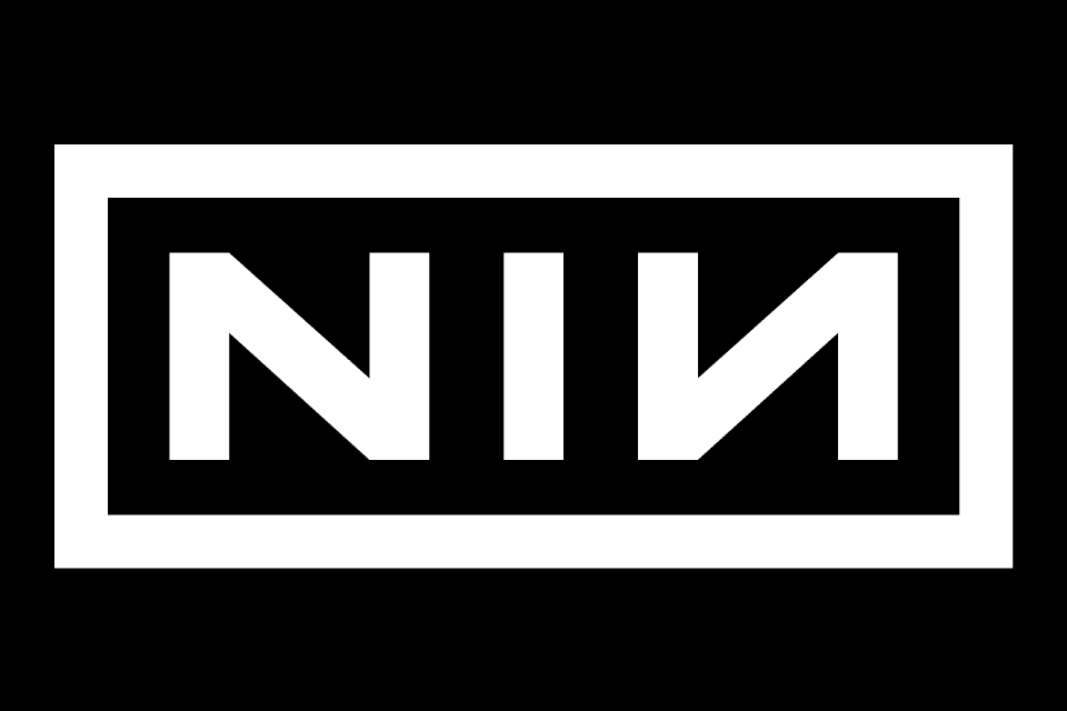
1. [NIN] Logomark, 1989
The NIN logomark, which was created by Reznor and graphic designer Gary Talpas, first appeared in the “Down In It” video and has been used, largely unaltered, since 1989. It is practically flawless. It utilizes uniform line weights, mathematic spacing, bold letterforms. “NIN” is a true acronym, as opposed to an initialism. Its abbreviation is an alternate spelling of the first word it represents. The mark is symmetrical. It is graphic. It is containerized. It is legible. It is easily recreated from memory. It reproduces well at all sizes. And the list goes on.
2. PRETTY HATE MACHINE Album Packaging, 1989/2010
The original Pretty Hate Machine packaging (1989) was built around a photograph of a microphone, colorized in an early-digital, mock-psychedelic, Photoshop line-screen. Comp-lementing the image was the of-its-time use of entirely lowercase lettering—typography that was further distinguished by four instances of the backwards letter “n” in the band’s name. This simple reversal, an echo of the 1980 Talking Heads record Remain in Light (which vertically mirrored the two “A” characters in the band’s name, and was made by the legendary designer Tibor Kalman at M&Co), has since become a staple of the NIN graphic identity. The 2010 remaster, designed by NIN creative director Rob Sheridan, who dropped out of Pratt in 1999 and has since become the unofficial second member of the b(r)and, normalized the color of the original and set the title in all-caps in the typeface DIN. It was a debatable improvement; its effect is sort of like putting an unobjectionable necktie over an endearingly shitty, hand-studded jacket.
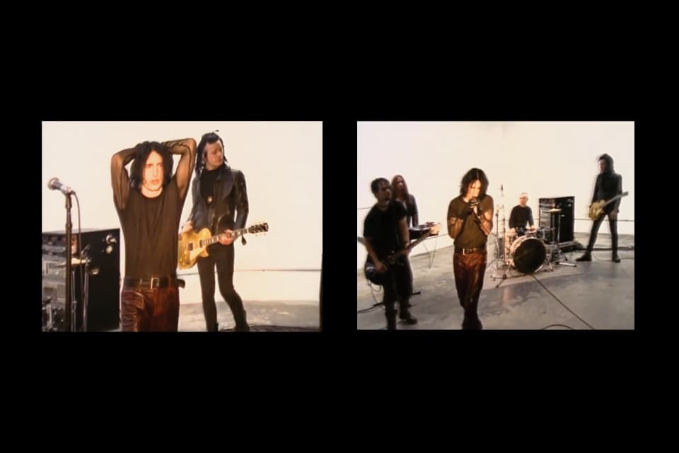
3. “MARCH OF THE PIGS” Music Video, 1994
The single-take video for “Pigs” is ostensibly a lesson in gestalt: organic, geometric and linear black forms—clothed humans, amplifiers and drums, microphones and cords—on a gallery-white background. But perhaps more importantly, the spartan setup brought to the fore Trent Reznor’s appearance at the time: fishnet sleeves, vinyl in place of leather and a symmetrical middle-part and sideburns framing his face. In 1994, the look could be off-handedly dubbed goth, but the archetype Reznor put forth was far more complex, just as readily evoking teddyboys, cypherpunks, mods, rockers, victorians, creepers, punks and synth kids in one fell swoop (see also: The Crow, 1994). His body is the real subject here: the duck-toed, combat-booted, mock-stumble posture paired with grooming and sartorial gestures that would later form the template for countless adherents, Harry Potter’s Professor Snape among them.
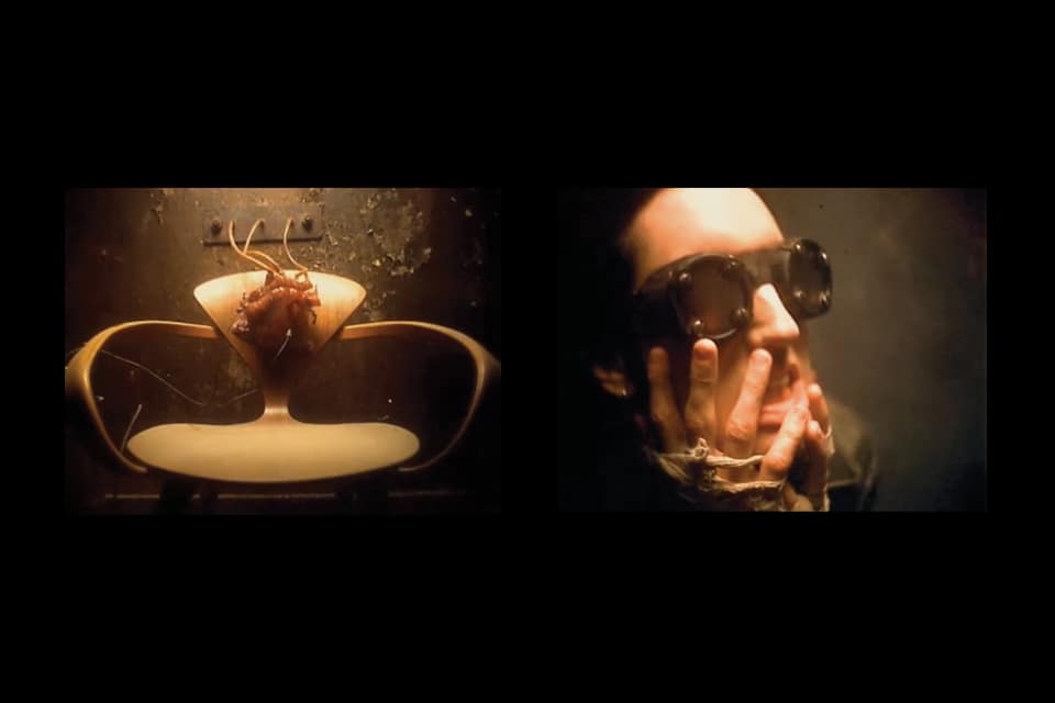
4. “CLOSER” Music Video, 1994
From the title card’s well-set type—a timeless, Germanic Futura—to the smattering of subverted midcentury American furniture throughout, “Closer” is full of high-end design. The bent-wood Cherner chair (1958; also the subject of a famous, 1961 Norman Rockwell Saturday Evening Post painting) serves here as a canvas for a pneumatic heart that pumps in time with the boom-bap of the song’s intro. Mixed in among meat hooks, cockroaches and ball gags, other haute bourgeois props include a Panasonic Orbitel television (1970) and a Warren Platner chair for Knoll (1966). In their time, these were Playboy-ready quotations of European modernism—nods to Danish, German, Italian and Swiss design. But in the context of Reznor and director Mark Romanek’s steampunk dream, they jumble to provide a template, of sorts, for years of NIN visuals to come: nostalgia for multiple eras while speculating future decay.
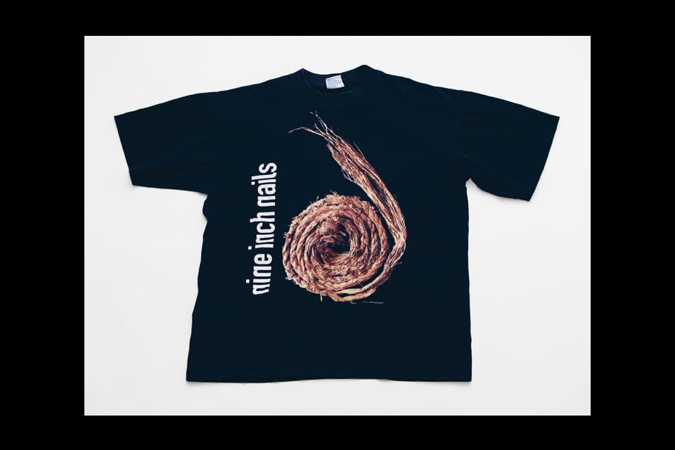
5. FURTHER DOWN THE SPIRAL T-shirt, 1995
The artwork surrounding 1994’s The Downward Spiral and its 1995 remix record, Further Down the Spiral, promoted not just NIN’s music, but a consistent brand identity with an expansive and malleable palette. Designers and would-be designers used the flexibility of the spiral form in order to render countless official and unofficial pieces of merch. A spiral is a curled centipede, a spiral is a nautilus shell, a spiral is a classification of a staircase, a spiral is a coil of rope. In the realm of corporate identity, Reznor’s ’94-’98 empire is nearly unparalleled in its replicability: virtually anything could be Nine Inch Nailed via the inclusion of a spiralled form. The shirt—black, as all concert tees should be—also used DIN 1451, a typeface that would ultimately serve as NIN’s house style.
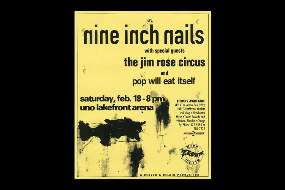
6. UNO LAKEFRONT CONCERT POSTER, 1995
Much like the image of a spiral, but even easier employed, the brilliance of Pretty Hate Machine’s reversed “n” characters was that the masses could make them. Producing a convincing bootleg of a NIN T-shirt, bumper sticker or handbill was simple as could be—all one needed to do was find a way to render type, and then reverse all the instances of the letter “n.” With just that gesture, even the most commonplace of chartreuse Xerox prints—like this radio station’s simple flyer for a ’95 concert in New Orleans, which also employs overlaid splotches of The Downward Spiral’s cover art—appear as though they came directly from the band’s hand. No matter the font, no matter the substrate, no matter the accompanying imagery, this was a graphic identity that was infinitely reproducible—democratic, populist, egalitarian. A demonstration of affiliation with the band and its output was free and available to all.
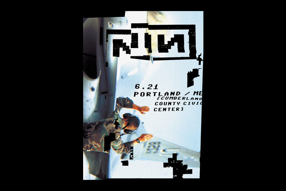
7. WITH TEETH Poster Series, 2005
The mid-aughts saw Rob Sheridan looking to humanize the computer on behalf of the band. The post-Matrix glitch patterning and nods to 8-bit console gaming were paired with typographic characters initially rooted in programming language: slashes, brackets, underscores, etc. The digi-NIN logo, still recognizable in an entirely different typeface, was rendered atop images of American military personnel (2004 marked the US Army’s changeover to entirely pixel-based camouflage) while the fabricated glitches gestured toward humble machine-embroidery and similar analog processes. This ersatz corruption of visual information recalls the years that birthed the band, readily conjuring up the heady, circa-1990 design experiments in graduate programs at Cranbrook and CalArts, where students reworked ’70s and ’80s postmodernism, as well as the rock & roll magazine Ray Gun, which brought those academics’ deconstructed style to the mainstream as grunge. At present, however, that nostalgia for the recent past and its accompanying quest for digital imperfection may just look, you know, imperfect.
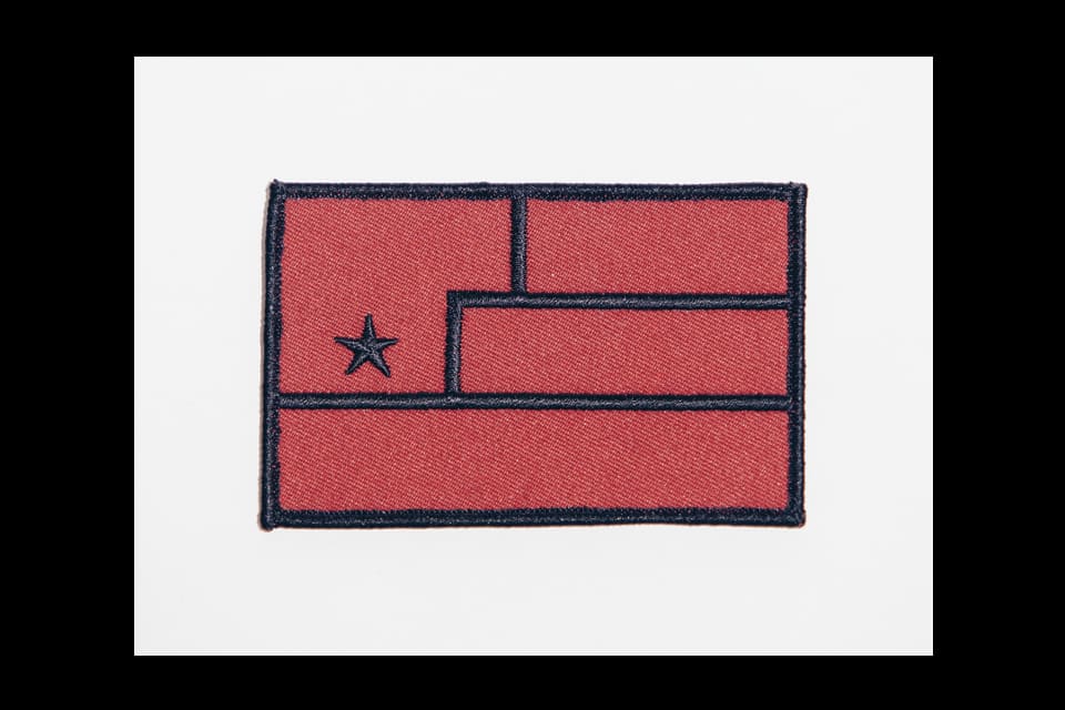
8. YEAR ZERO Patch, 2007
Efforts in so-called guerrilla marketing around 2007’s concept album, Year Zero, marked a significant graphic departure from the digital styling of With Teeth. Deep in the second Bush’s presidency, and in the wake of Green Day’s mock-propagandistic American Idiot, Sheridan designed a series of marks and images on behalf of an unfortunately named, dystopian, science-fictional initiative called “Art Is Resistance.” The principal mark was a flag-like composition—an abstraction of a fist with a Communist-referencing, five-point star on its palm—that borrowed heavily from midcentury and Cold War-era nation-branding. But the artwork for the album’s associated ephemera offered scant commentary on its plentiful visual references, and therefore contributed little to its formal predecessors, the era of its creation or the future it imagined.
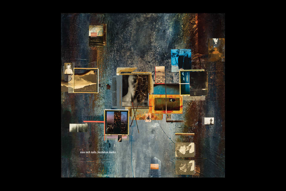
9. HESITATION MARKS Packaging, 2013
The artwork for Hesitation Marks was made by Russell Mills, who most memorably worked with Reznor 19 years ago on 1994’s The Downward Spiral. Not so much has changed, really: the band’s look is still steampunk abstract expressionism via computer, like channeling Gerhard Richter through Adobe Creative Suite. On the new record, the typeface DIN reappears, the title is rendered in all lowercase letters, the “n” characters are still backwards, there is some Photoshop magic and many of the textures are sepia-toned or distressed. The composition seems to seek forward movement in an almost insta-retro-futurist sort of way—simultaneous nostalgia and futurism, a tone that has defined the band’s visual output over the past 25 years. Given that quarter-century tenure, it’s somewhat surprising that the NIN aesthetic is in many ways more ambitious than ever: there are four available covers for the new record. There is one for the vinyl LP, one for the standard compact disc, one for the deluxe compact disc and one for the digital download—omnipresence via multimedia platforming. NIN is a really good band. NIN is a really good brand.