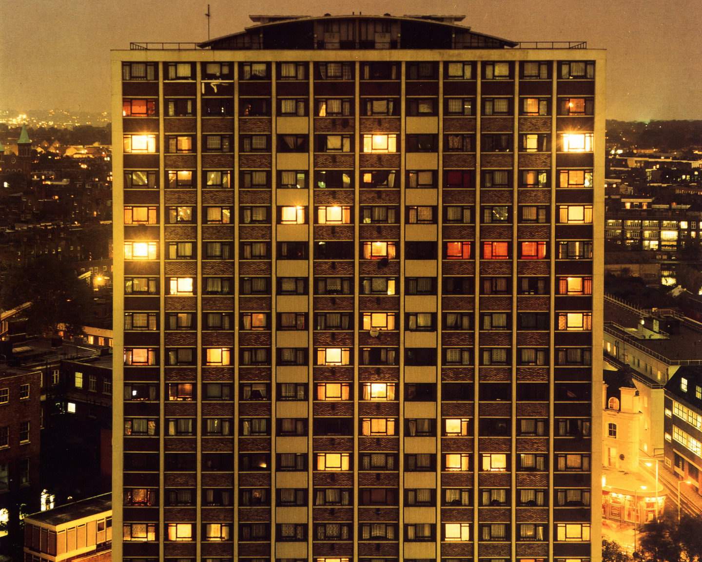
 "Towering Inferno” (1995) by Rut Blees Luxemburg
Courtesy Rut Blees Luxemburg
"Towering Inferno” (1995) by Rut Blees Luxemburg
Courtesy Rut Blees Luxemburg
“Towering Inferno” is name of a 1995 work by German artist and photographer Rut Blees Luxemburg, shown above. The Rear Window-style image looks straight ahead into the flats opposite (the real life east London tower block Kestrel House, on City Road). It’s nighttime, and some of the windows are illuminated, others have their curtains drawn. Today, that image is best known for appearing as the artwork for Original Pirate Material, The Streets’s debut album.
The photograph comes from Luxemburg’s 1997 collection London: A Modern Project. Luxemburg is interested the utopian ideals of modernist architecture, shared spaces, and the London that exists at night, outside of the confines of the ordinary working day. In this sense, her concerns aren’t dissimilar to Mike Skinner’s on Original Pirate Material. His nocturnal world is also set outside of a 9 to 5 structure; the “sex, drugs, and on the dole” lifestyle he depicts is punctuated by “sharp darts” of inspiration pondered over a spliff.
On the 15th anniversary of the release of Original Pirate Material, The FADER spoke to Luxemburg over the phone about the beauty she sees in high-rise buildings, the stigmatization of social housing, and what it means to stand face-to-face with your subject.
Tell me about the day you shot this photograph in 1995.
I think I was 28. I was an MA student studying photography at the University of Westminster. At the time I was very interested in how the architectural movement of modernism was represented in Britain. I found modernism in these social housing estates, yet [the estates] were stigmatized. In my work I try to find the beauty in the illumination, the structure, the clarity of the architecture.
I worked with a large format camera and I worked with film. This was actually pre-digital, and that’s why also you have this incredible detail. You can almost see into the people’s apartments. Everything is sharp, so you can really immerse yourself in the city.
Did you have a relationship to U.K. garage at the time?
No…That actually came later. In ’95, what was going on in the U.K. at the time was pirate radio. The kind of places around that estate — the roofs — would’ve been used to do pirate radio.
The Streets used this image as the cover of Original Pirate Material in 2002, seven years after it was originally taken. How did that happen?
The record label approached me. At the time I had not heard of The Streets. I think hardly anyone had; they were not a mainstream phenomenon [at that point]. So for me, it was actually a sort of leap of faith to associate my work with their work.
How did you know it was a leap of faith worth taking?
They gave me some tracks to listen to, and the sentiment of the lyrics, or the ambition of the lyrics to articulate this other experience of living in the city, really chimes with my work. It’s what I was trying to express visually — these places are hothouses of creativity. They hold within them real kernels of social change and expression.
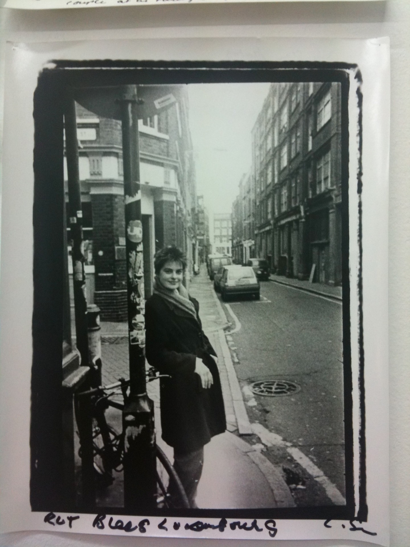 Rut Blees Luxemburg in the 1990s
Chris Shaw
Rut Blees Luxemburg in the 1990s
Chris Shaw
Did you ever meet The Streets?
We’ve never met. But that’s okay; I know that the bond is there.
A number of photographs from your collection London: A Modern Project could’ve worked for this album artwork. Why do you think they chose “Towering Inferno”?
It was the perfect one because when you listen to that album, you really have the sense of this guy living in a similar estate, in his bedroom, doing the music. There’s something quite intimate about [Mike Skinner’s] music because it suggests an interior place. Although it talks about the city, it comes from a private experience.
What’s cool about the photograph is that you’re not only looking at a tower block, but you’re looking at it from the perspective of a tower block as well. You’re kind of level with it. Why did you decide to take it from that angle?
You have to understand that I [was] on another high-rise, photographing a high-rise. I [was] on the 16th floor. By photographing it so straight-on, it’s almost like a portrait. It’s respectful because I’m not overwhelmed by it, I’m not cowering under it — I’m actually face-to-face with it, so it’s more about a dialogue.
“When you listen to that album, you really have the sense of this guy living in a similar estate, in his bedroom, doing the music. There’s something quite intimate about [Mike Skinner’s] music because it suggests an interior place.”
When the record came out, you must’ve seen posters of the album artwork all over London. What was it like seeing your image of architecture become part of the architecture of the city?
It was everywhere — it wasn’t just in London. [The advertising campaign] was European. When I travelled to Paris, I saw the poster. It was exhilarating. The work is my critique of the conventional representation of public space, so it was fantastic for me to see my alternative representation of these alternative buildings made public everywhere in the city. I was delighted! [Laughs]
Also, the poster campaign really featured the high-rise; the logo was very small, it was a lighter. People responded quite strongly to [the photograph], and still talk to me about it. I still get emails from people for whom this was a very important moment in their youth. That poster really exemplified something about the music and how they felt about growing up.
Do you feel that the London you captured in that moment is the same London that exists today?
That’s a very interesting question, because when we look at a photograph we often think it records a moment that’s gone, and I really believe that photography also has the ability to capture the future. For me it doesn’t represent the past — if something is still happening, it’s not, This is all gone, this is all over. It still has presence; it’s still trying to do its work, to propose something. Because the image is a proposal, all these people living together in this building, all these lights coming on and off, it’s a network. It’s a very positive image.