 Rachel Weisz in Dead Ringers.
Courtesy of Amazon Studios
Rachel Weisz in Dead Ringers.
Courtesy of Amazon Studios
In a TV and movie landscape that can often feel bogged down by reboots and a dependency on IP, Dead Ringers pulls off a minor miracle. The Amazon Prime Video series is based on the 1988 David Cronenberg movie of the same name but doesn’t exist to remind viewers of the past, instead it using the story as a vessel into which writer Alice Birch has poured big ideas about the state of the American healthcare system — specifically how it treats mothers.
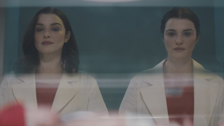
Rachel Weisz plays sisters Beverly and Elliot Mantle, a pair of codependent gynecologists. What could feel gimmicky — one person taking up two roles at the same time — instead heightens the sense of the uncanny that runs throughout this version of Dead Ringers. Weisz makes each sister their own person: Elliot is wild and unpredictable, Beverly far more reserved. It’s not an exaggeration to say that while watching, you can forget that they’re both played by the same actor.
Dead Ringers follows the Mantle sisters as they confront the dark reality of childbirth, including the high rate of mortality (particularly in Black mothers), inequality, and spiraling costs incurred by those who encounter complicated births. The series begins with Beverly holding her own miscarriage in her hands. It’s a confrontational opening that sets the tone for the uncompromising action to come. Their dream is to open a birthing clinic that provides a greater level of care for women, but that requires money. Dead Ringers is withering in its depiction of philanthropist billionaires The Parkers, a pair of Sackler-style sisters looking to invest in a good cause while aggressively pushing the bottom line at the business end. Tensions naturally arise as the Mantles make their way through this dicey landscape where compromise is key to progression.
With such intense and harsh subject matter, it may feel glib to describe Dead Ringers as visually beautiful, but it truly is stunning to look at. This, in no small part, is down to production designer Erin Magill, whose work helps deepen the scenes and add extra context to the themes at the heart of the story. The bloody and brutal hospital scenes play out on an austere, almost sterile, backdrop while the devilish Parkers seem to largely exist in elite spaces buried deep underground. The twins' codependency, meanwhile, is highlighted by the Art Deco bathroom they share in their New York apartment. What escape is there for two women who share everything, even a mirror to brush their teeth in?
I spoke with Magill shortly after the launch of Dead Ringers to learn more about the ways she went about her work as a production designer and how she represented the themes of the series in every setting.
The FADER: What was your relationship to the original Dead Ringers and what did you think when you heard a TV version was in development?
Erin Magill: To be honest, I hadn't seen it for a long time. But my memory of it was always being a bit disturbed. Jeremy Irons' performance was just brilliant. And so I was very intrigued because I just have been a fan of Rachel's work for forever. And I knew that the information I had been given was, I knew that, I mean she was one of the people that first interviewed me, she was an executive producer and very involved in the development.
And Alice's work, I was just a big fan of as well before, and that's before even getting a chance to read the scripts. And then I had the chance to read them and I was desperate to get the job because I was just, it's not often you get sent something that's honestly as wonderful to read as a really good book and you just want to keep turning the page.
When you’re working on something like Dead Ringers do you want to have similarities or references to the original or is it more important to establish an entirely unique visual identity?
I think a lot of that was always going to be in conversation with Alice and Sean [Durkin, director]. There's that level of respect to the original you want to pay a bit, which I think very early on in our conversations, I think the most glaringly obvious homage that was decided upon, was that very iconic red scrub idea. That allowed me in certain places to try to pay homage when it made sense. Because I think the biggest difference was of course, this is now set in the present day.
But this is six episodes versus a two-hour movie, and there's a lot more story to cover. So it wasn't necessarily always right to play with the same look that the original film had. But that original apartment was very of the moment, at that time in the '80s in New York. It was considered a very modern Italian inspired-apartment that I think it was interesting in the way that design trends are a bit cyclical.
That there were certain shapes and textures or architectural styles and ideas that people go through that were actually very in fashion again and that I felt really did lend themselves to the world I was trying to create for the sisters. Having them step down into a conversation pit, for example. And some of their communal space was very sleek and sterile in a way that I felt made sense for the fact that their lives are entirely about the hospital and their work there.
The twins' jobs as gynecologists is key to the themes of the series. What kind of story did you want to tell with the Westcott Memorial Hospital and the way it looks?
We needed to show them in a world where they have worked their way to the best of the best. And so there was a lot of research into what these spaces look like out of Mount Sinai or Lenox Hill and how could I physically show some of their frustrations and why they were looking to get this money from the Parkers to start their own birthing center. And part of that was, I think a lot of those spaces are, they were maybe designed 50 years ago. They're very haphazard and they can be very claustrophobic and very maze-like.
They’re not necessarily designed in the most economical, functional way of care being the number one priority. So that was really the goal of what I was building; something a bit prison-like, a bit claustrophobic, very dark and bureaucratic and frustrating environment. You really understand why they want to leave.
In addition to the workplace, we've also got the twins’ apartment. I wondered if you could talk me through the ways that the apartment acts as a visual representation of the codependency that these two sisters have with one another.
So the idea was to show this certain level of status that the twins had reached. And that when you enter their apartment, again, that kind of, what I would call the more communal space, the foyer, the living room, the kitchen, a big idea was, in general, there are not a lot of walls. On a very basic level the lack of boundaries going on there. The color palette is also very muted in this way which is a bit sterile and feels a bit medical.
When we're in Beverly's room specifically, there were some choices in terms of the window shapes and the Terrill light structure over her fireplace. And her room is very much a sanctuary and this place where she can go and relax. Elliot’s room, meanwhile, is much more vibrant and filled with saturated colors and chaotic patterns.
I wanted to end by speaking about another show you worked on, Ziwe…
Oh yes.
Maybe you saw, maybe you didn't recently, the Netflix India YouTube series that a lot of people, including Ziwe, called out for copying your original set design.
I saw that.
I just wanted your take on that. What did you think when you saw it?
I mean, I was like, well, that's a real close to the design I came up with. Yeah, I was a bit shocked. It was not necessarily a great look for that show in India. I mean, sure, it's a form of a compliment and flattery, but it, yeah, it was a little too strikingly similar, I would say. I think the host clearly has a style very similar that she might have borrowed from Ziwe as well, so yes.
Maybe you could add it to your IMDb page as an additional credit…
I don't know. I don't know if I like all the new choices they made. I don't think they made all the right choices, so I don't want full credit for that!