A picture is worth a 1,000 words, but how many should an album cover be worth? The several artists, designers, and photographers we spoke to behind some of 2025's best album covers can't say for certain but, according to SSION, he knows he's got it "when he sees it."
From Geese's Getting Killed to Rosalía's venerable LUX, so many album covers caught our eye this year, adding intrigue and depth to our favorite music of 2025. Just in time for the Grammys to bring back their Best Album Cover category in 2026, we reached out to the people responsible for the striking images — a band member pointing a gun and a trumpet, a pop star in nun garb — to learn how they made them.
Geese, Getting Killed
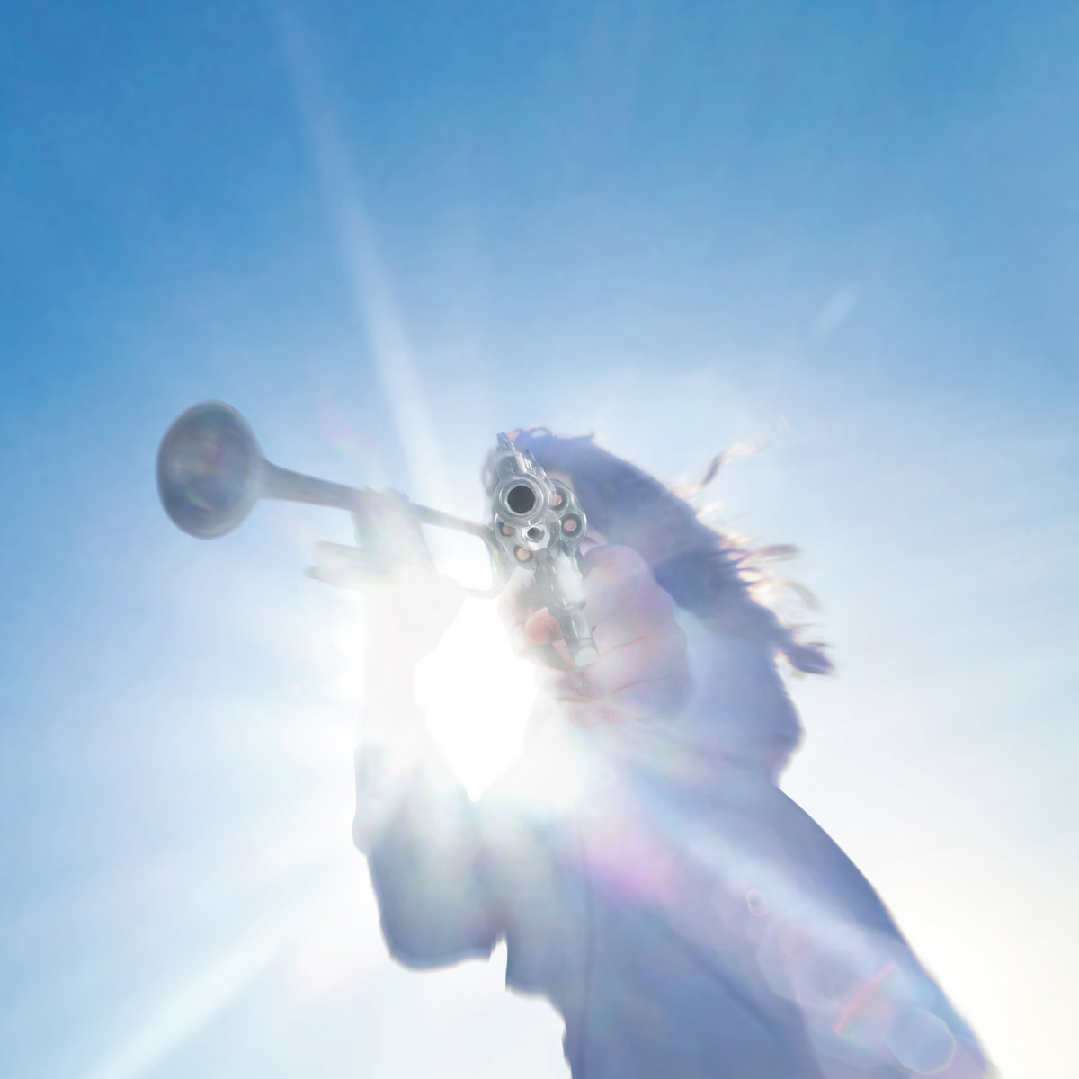 Mark Sommerfeld, Kyle Berger, Phil Gibson
Created by photographer Mark Sommerfeld, designer Kyle Berger, and creative director Phil Gibson, as told to Steffanee Wang
The FADER: How did you conceptualize the artwork for Getting Killed?
Phil Gibson: Ideation began the second the album title was mentioned. It hit me like a brick and I fell in love. In early talks with Cameron and the band, it was clear we were in a moment of real reflection — the band was almost psychically aware they were about to cross a major threshold. Those same talks revealed a central theme that stuck with me throughout—the feeling of confidently moving forward while putting an old chapter to rest. The real fun was considering the perspective of the title ‘Getting Killed.’ Who or what is getting killed? Who or what is doing the killing? Are we picking a side or leaving it to interpretation?
We considered films led by anti-heroes; where Death is incarnated, even romanticized. Everything from Goodfellas to The Seventh Seal. We also looked back to some of my favorite paintings by Thomas Cole or Sascha Schneider who were masters of capturing the radiance of life and the depths of death. Personally, something about bouncing between early demos of "Trinidad" and Full of Hell’s "Trumpeting Ecstasy" fueled a lot of my ideation at the start. Once that conceptual foundation was locked, we were free to play through a lot of ideas on set.
Mark Sommerfeld: One of the many sparks for me was a line in “Half Real” which refers to getting a lobotomy that takes away the bad times, and the good times too. “I’ve got no more thinking to do.” My interpretation of these lines reminded me of the virtue of reacting instinctively, versus over thinking. Analysis paralysis often feels a lot like getting killed, slowly.
I’ve long been drawn to art that asks more questions than it answers and I think collectively we were on the same page about this ~ attempting to create an image that hints at the aforementioned themes while simultaneously drawing in the curious, posing questions rather than offering crystal clear answers.
What is a challenge you faced while creating the album art?
Sommerfeld: This question feels a little like a trap, haha. Whatever “challenges,” we faced were a healthy part of moving towards a common goal. It really was the truest, most rewarding example of collaboration I’ve been a part of for a long while.
I think most people who work collaboratively learn to expect the unexpected. Less than an hour into the late afternoon shoot, on my rooftop in Ridgewood, Queens, Cameron offered a suggestion: shoot toward the sun instead of away from it. Instead of shooting with the sun, Emily’s white dress bathed in the end of day light against a blue sky, we did a 180 to move toward the backlit look which became central to the final album art. Practically speaking, the sun was no longer precisely where we wanted it (see Kyle’s notes) to be but a combination of shooting while starfished, belly to the roof, and bringing Kyle onto the project proved to be a worthwhile pivot and now I can’t imagine having shot it any other way.
Berger: Changing the tilt of the earth while maintaining a grounded and realistic edit of Mark’s original images. The learning curve, from my perspective, came through parallel creative thinking; the impetus getting distilled slowly through everyone’s hands until the final image was completed.
What's your favorite album cover from this year (that you didn't make)?
Gibson: I keep coming back to the cover to TAGABOW’s LOTTO. It’s one of those magical pairings where both the cover and the record offer a little something different each time you look or listen.
Sommerfeld: Dijon, Baby. Simply, it’s a photo I wish I took but it also hints at the content of the record. There’s an unbridled humanity that hits like a hug — its honesty and sweetness is exhilarating and makes me want to cry, while dancing my way home to my lover… and it all starts with the cover!
Berger: I really like the album art for Bad Bunny’s DeBÍ TiRAR MáS FOToS. I think it’s heavy with personal symbolism and meaning while being broadly universal. The image exudes nostalgia, cultural identity, and location, all with a couple chairs and a plantain tree.
Rosalia, LUX
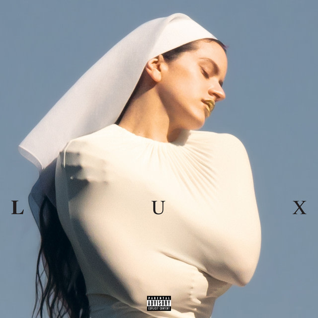 Noah Dillon / @noahpdillon
Created by photographer Noah Dillon, as told to Steffanee Wang
How did you get connected to Rosalía and involved with the album cover?
Noah Dillon: Her team reached out at the request of Rosalia and Pili (creative director.)
How did the cover image get conceptualized? Can you describe the day of that shoot and the moment you shot the winning image?
The cover wasn’t conceptualized. The image was taken in passing between locations. It happened quickly and wasn’t thought of as something special immediately (in my eyes) until a few months later.
What, to you, makes a compelling album cover?
A compelling cover communicates the vision of the artist and shows them something about the work that they hadn’t yet seen.
Perfume Genius, Glory
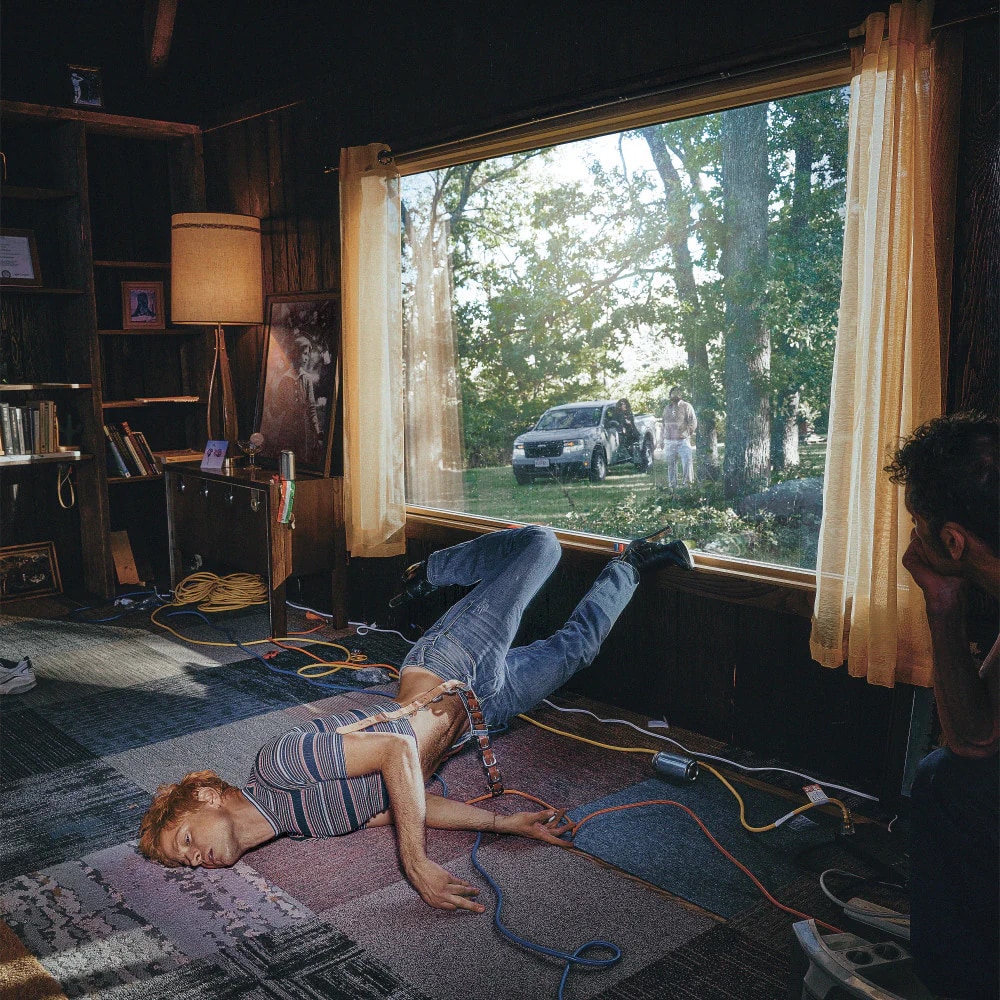 SSION / @ssion_official
Created by SSION, as told to Tobias Hess
The FADER: How did you conceptualize the artwork for Glory?
SSION: When Mike and I first started talking about the album and the world around it, everything began with a feeling. He had a lot of cinematic references, but nothing too specific or literal about what it needed to be. This allowed us to prioritize discovery rather than locking ourselves into a fixed idea.
We both wanted the final image to feel evocative and slightly hard to place, like a snapshot pulled from a moving scene. It sits right at the intersection of what excites both of us: something beautiful, tender, and sweet, but also cheeky and a little absurd, with a surreal darkness humming underneath. I love when people look at the cover and can’t quite pin down the aesthetic. That ambiguity is always the sweet spot.
What challenge did you face while creating the album art?
The biggest challenge was committing to a single location and trusting we could find the right one. I knew I wanted to anchor the project in a house, a space we could pull apart and reassemble across the photos and the music videos. We shot everything in Kansas City, Missouri, a city I return to often because it gives me the freedom to play and experiment. It still feels visually untapped to me.
Finding the house itself was the hardest part. We didn’t want it to feel sad or broken, but we also didn’t want it to feel aspirational. It needed to live somewhere in between… nuanced, lived-in, and filled with small, specific details that connected back to Mike and the album. It was about pulling together seemingly random elements and letting them resolve into something intentional. The house we ended up in was a strange mix of vintage and modern… a little odd, slightly pastiche, and intentionally hard to define. We shot in almost every room, knowing any image could potentially become the cover. When we reviewed the photos, it became clear which ones carried the most weight.
What makes a compelling album cover?
I’m not sure but I know it when I see it.
What allows for your successful ongoing collaboration with Perfume Genius?
Mike and I first collaborated on the “Queen” music video, which I directed, and it’s still one of my favorite things I’ve ever made. From the very beginning, there’s been an easy, natural flow between us. He’s someone I feel genuinely close to… we laugh constantly, but we also take what we’re creating seriously and we want it to be great. Working with Mike always elevates what I do. There’s a deep trust there, so I never feel like I can’t pitch the most insane idea.
At the end of the day, it’s just the two of us following impulse and instinct. We genuinely enjoy the process, even when it gets a little demented. I think we both kind of prefer it that way.
Jim Legxacy, Black British Music
 Joshua Miguel / @gumskool
Created by artist Joshua Miguel, as told to Kylah Williams
The FADER: How did you conceptualize the artwork for Black British Music?
Joshua Miguel: Jim’s vision for [Black British Music] was huge so the cover art had to match how monumental the album was. We wanted to convey the emotions and narrative of the album on the cover art as well as the incredible and chaotic production on the album which is just insane but so beautifully executed.
I worked super closely with Jim making the cover arts - we would work on Discord and I’d share screen - there was a lot of back and forth on ideas and a lot of experimentation. Jim has an amazing eye for graphic design.
What is a challenge you faced while creating the album art?
I would say it was just ensuring that imagery was easy to see without also being immediately obvious as to what you were looking at, just tryna create the balance in the composition of the collaging where the imagery worked well with each other
What makes a compelling album cover?
I think what makes a compelling album cover is a somehow the visuals reflect the album sonically in my brain. That makes it memorable, honestly I don’t think there is one formula.
What's your favorite album cover from this year (that you didn't make)?
There’s been some amazing cover arts this year but my fave goes to fingers crossed by kwes e.
Destin Conrad, Love on Digital
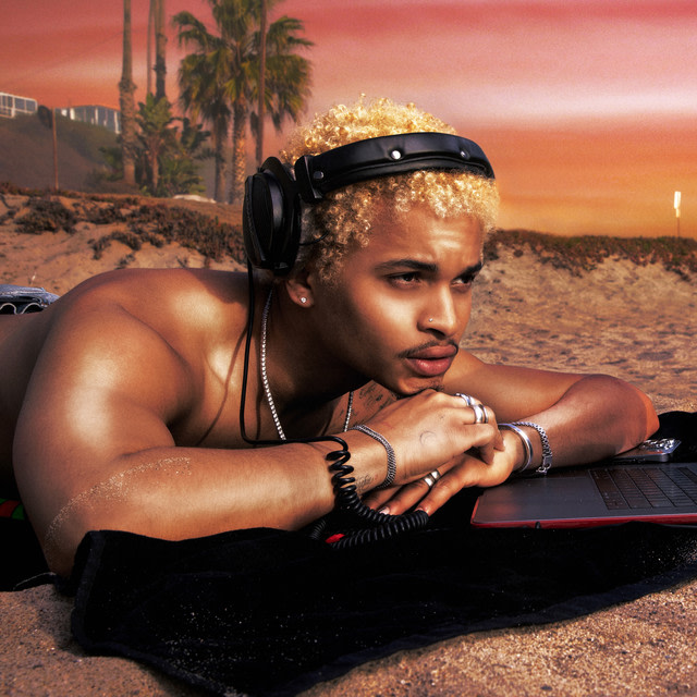 Angel Rivera / @angelrivz
Created by photographer Angel Rivera, as told to Kylah Williams
The FADER: How did you conceptualize the artwork for Love On Digital?
Angel Rivera: The artwork was a collaboration of ideas between Destin and I. We originally shot the tour poster photo thinking it would be the cover. He knew he wanted it to feel crowded, with people frozen in different stages of movement. But I also wanted a photo of Destin using his laptop at the beach, disconnected from the real world and more immersed in the digital one. When I sent that photo to Destin, he knew right away that was the one.
What was a challenge you faced while creating the album art?
One of the biggest challenges that day was the weather. When I had scouted the location the week before, it was a perfect sunny day, blue skies, all that. The day of the shoot, I noticed some fog rolling in as we were setting up - my worst nightmare. Not because fog can’t look cool but because I had a specific vision in my head for how I wanted the photos to look. The fog ended up being a blessing in disguise.
Fun fact: The skies/sunsets on this cover were all done in post! [Because] the day of the shoot ended up being super foggy, I did everything in Photoshop: Adding in color, clouds, I’m really proud of these.
What, to you, makes a compelling album cover?
A compelling album cover is one that you makes you stop and stare. Something about it grabs your attention. Makes you stop scrolling in a playlist. Makes you feel something while you’re listening to the music.
OsamaSon, Jump Out
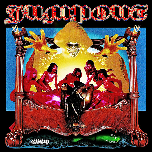 Henry Tuori / @fullmetalgallery
Created by artist Henry Tuori, as told to Kylah Williams
The FADER: How did you conceptualize the artwork for Jumpout?
Henry Tuori: When I pitched the cover idea to [Osamason] he immediately liked it. He was like "Wow I just saved that before you sent this pic", and it was a t-shirt with a Sabbath Bloody Sabbath graphic. It felt prophetic. We went with it.
Once the gears began turning only O and I really believed in that idea. I think at first it was hard for people to imagine me bringing it from a shoot to what you see now. I pushed back and and we stuck with it. We did the shoot around December 20 and I had until January 5 or so to finish it. We bought the bed, picked out the girls, I directed it over FaceTime and GK shot it. There was a lot of work that went into getting all that stuff to actually happen.
Once the material was in my hands I went through all the photos and started building the cover. I didn't start from a single photo, but a blank document where I imported multiple photos into a larger collage. I think that's an important differentiation. I worked on it every chance until the deadline, overnight like every night. The original shoot transformed pretty drastically, I made almost 100 versions on the way to the final.
I finished at like 6 a.m. one morning and everyone loved it. It felt rewarding immediately. I think we all were very excited to share it. The rest of the Jump Out visuals were built primarily after the cover. I think we succeeded in creating what will be remembered as a "final boss" in the homage zeitgeist.
What is a challenge you faced while creating the album art?
The [album] leaks around the time caused a ton of stress. We were all working so hard every day and it almost felt like some evil force was out there rubbing its hands like "let me make it x amount harder for them." It felt very unnecessary. But we made it work, we had to. A lot of [visual] material gets scrapped, why post a trailer of a song if it already leaked? Then all the work that went into the teasers and rollout is essentially wasted. It's cruel.
What makes a compelling album cover?
To be honest I think it's apparent when cover artwork is label procured or otherwise divorced from the recording artists creative process. A cover is how a project is perceived at almost every point besides when you have headphones in and are actively listening to it. It's critical.
If artists are fully outsourcing or careless about this it's a huge strategy mistake in my opinion. Listeners can tell, and people are increasingly aware of when conflicting interests make it to the final product of any creative endeavor.
What's your favorite album cover from this year (that you didn't make)?
I love Che's REST IN BASS album cover. Gritty, grotesque. Those shades of green and purple you don't often see make it to the final version of any project, they're like work-in-progress colors. But they made it and it looks amazing. Shoutout to @thenucleargladiator, Gavin and the rest of that team.
Skaiwater, #mia
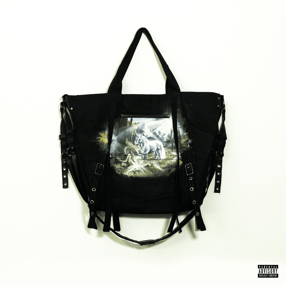 Peter Cepeda / @pc.401
Created by artist Peter Cepeda, as told to Kylah Williams
The FADER: How did you conceptualize the artwork for #mia?
Peter Cepeda: It all just fell into place over time. My design language came from how I was painting bags and shooting them. I didn’t conceptualize it as an album cover, but more so as a product shot for a finished piece as if it were in a museum or gallery.
Around this time, Skai and I started getting closer as friends. We realized that a lot of our ideas overlapped within our art. Our ideas just built on each other's very well. We were pretty much into a lot of the same shit and ideas. In terms of the process – at least for #mia – it was very hectic. I actually skipped class to finish the cover in time. I ended up finishing it by 6 a.m., shooting it by 12 p.m., and submitting that same evening.
What is a challenge you faced while creating the album art?
I hope it doesn’t sound conceited, but there were no challenges. I love painting.
What, to you, makes a compelling album cover?
It’s gotta have great composition and subject matter (colors).
What's your favorite album cover from this year (that you didn't make)?
See u soon by Destroy Lonely. I really think that the SDP video set the stage for the aesthetic of the album. My friend d-fly (@afterlifeinparis) shot it and directed it. That video was just so clean. His vision led the way for an amazing cover.
Ninajirachi, I Love My Computer
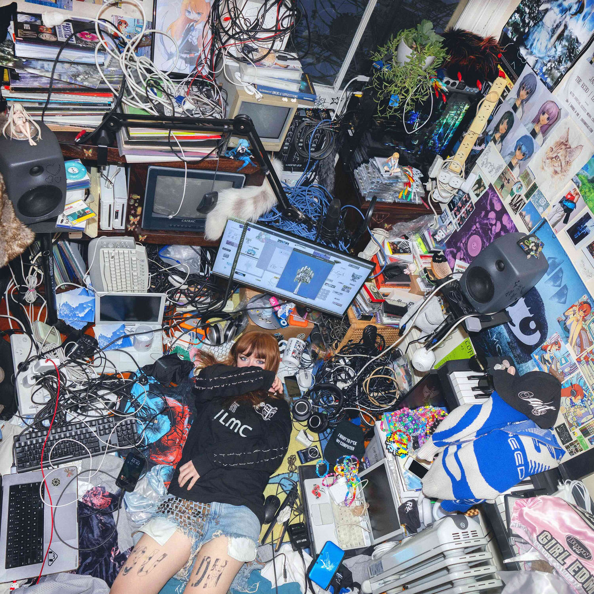 Aria Zarzycki/ @angel.fuel
Created by photographer Aria Zarzycki, as told to Kylah Williams
The FADER: How did you collaborate with Ninajirachi while making this album cover?
Aria Zarzycki: We shot the image in Nina’s bedroom, using almost exclusively items she already had around the house, along with a few things borrowed from friends. Nina is very engaged and hands-on in everything we do together. From positioning certain items herself to spending hours in Photoshop with me fine-tuning details, the process is always highly collaborative.
I wanted this cover to feel like the music I had been listening to for months, and to be something that could still grab someone flipping through vinyl bins 30 years from now and make them want to check it out. There was a song that didn’t quite make it onto the album, and we hid a reference to it in the artwork — but I won’t say where 🙂
What is a challenge you faced while creating the album art?
The biggest challenge I can recall was posing Nina within the set. At first, I had her sitting upright and looking into the camera, lying on her stomach, and trying various other positions, but nothing felt quite right. After experimenting with many different outfits, makeup looks, positions, and angles, we decided to come back the next day and reshoot. After reviewing hundreds of images, we realized the angle where she was lying down with her face partially covered felt the most right.
What makes a compelling album cover?
Meaning and effort.
I love when an image feels like the body of music itself. There’s something special about seeing a cover for the first time and instantly forming a snap judgment about how it might sound. Lately, I’ve noticed a lot of album artwork has leaned toward minimalism — fewer colors, just a logo, a word, or a single object. I’d love to see more covers that really push creativity. Effort is also very perceptible; when a lot of time and energy goes into making something beautiful and meaningful, you can usually feel it.
What’s your favorite album cover from this year (that you didn’t make)?
Choke Enough by Oklou. It’s quite beautiful.
Editor's note: This article was updated to include an entry about Ninajirachi's 'I Love My Computer.'