


Creative director and designer John Patrikas builds worlds around ambiguity. When it comes to artists needing to signal a bold and transformative new era — Addison Rae, Sabrina Carpenter, Tyla, and Steve Lacy — he is the one they call. “My job is to take what an artist is feeling that perhaps they can’t quite articulate and build a visual world around that,” he says over a video call from New York.
Patrikas’s work, which include album covers and adjacent visuals for the aforementioned stars, defies the typical pop star formula: he packages friction and imperfection through kaleidoscopic colors and trippy graphics. “It’s about finding something true within an artist and uncovering something that’s been overlooked,” he says.

Read Next: We decoded Camp Flog Gnaw's 2026 lineup
Before his creative endeavors, Patrikas hailed from humble beginnings. His first job was as a paper boy in his small town. He’s the only artist in his family, and eventually, he abandoned his tiny community to attend art school in New York while getting into the live music scene in Brooklyn. In college, Patrikas worked as a gallery assistant at a contemporary art gallery. Eventually, he left his full-time job to go freelance eventually launch his eponymous studio. Ahead, Patrikas shares his creative process as a visual artist and working with pop’s biggest musicians.
 Courtesy of John Patrikas
The FADER: What inspires your creative process?
John Patrikas: I love mythology so much. I love building mysteries, characters, and stories. I grew up Roman Catholic, so my first understanding of beauty and sacrifice was rooted in that. My faith has somewhat wavered, but the closest thing I feel to spirituality is when I’m listening to music. I’ll get chills all over my body, like there’s something else here. I feel deeply spiritually connected to music. It’s everything to me.
My favorite film to go back to for inspiration is Superstar: The Karen Carpenter Story by Todd Haynes. It’s a biography about the singer Karen Carpenter, but it’s made entirely out of Barbie dolls. It continues to motivate me because if you want to make something, just do it. You can keep it simple, just as long as it’s true to you and the idea is maintained.
 Drafts from Steve Lacy's Oh yeah? album cover.
Courtesy of John Patrikas
Drafts from Steve Lacy's Oh yeah? album cover.
Courtesy of John Patrikas
 Courtesy of John Patrikas
How did the collaboration with Addison Rae come about?
Addison Rae reached out to me on Instagram. People didn’t fully understand how authentic and creative Addison is. She has this openness and hunger to her that I haven’t seen in an artist. If an artist is at a transitional point in their career, I love uncovering something that others may have overlooked.
Addison finds inspiration in the monotony of everyday life, if that’s what’s inspiring her. My friend, Dara, is working as her stylist. I wonder if I manifested this because I’ve always been into Addison, even during the “Obsessed” single that no one really moved for. My friend Christian and I would watch that music video, and we knew there was star quality.
 Drafts from Tyla's A*Pop album cover.
Courtesy of John Patrikas
Drafts from Tyla's A*Pop album cover.
Courtesy of John Patrikas
How did you approach Tyla’s A*Pop album cover?
My studio is in Chinatown where there is a lot of aging paint and signage, trucks driving with poorly designed graphics that might be funny to someone else, but I’m really inspired by. I also like the textures of chipping paint or rolling up on the edge of a letter’s corner. That’s where I got the idea of Tyla’s album cover for A*Pop. I wanted to showcase this funny quality to Tyla. By funny, I mean this carelessness that she naturally has. She’s been packaged as a perfectionist for a long time. And she’s at the point in her career where she wants to be a little more real.
For the cover, I used cellophane — it’s like plastic — and I cut out letters from it with a box cutter. I photographed each letter a million times and tried to roll the corners so it was coming off the page. I wanted the cover to feel alive, and like it had always existed. Nostalgic, but not in that “poisonous” nostalgia that we’re seeing every single day, like a flattened subculture aesthetic way.
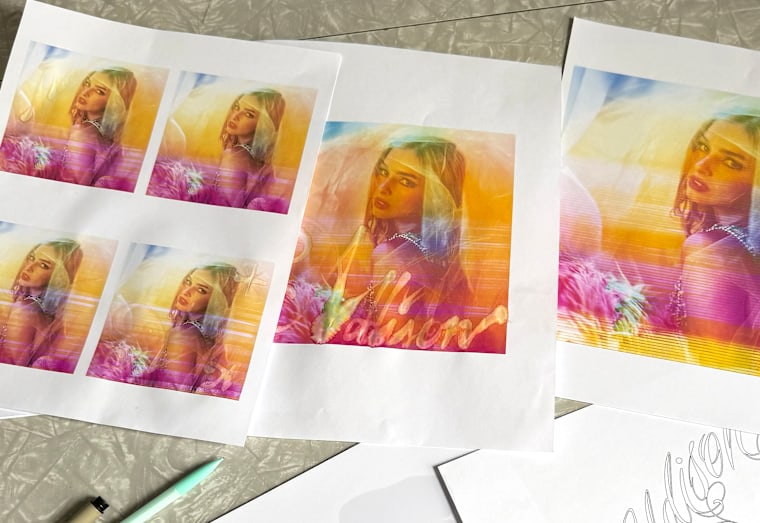
 Drafts from Addison Rae's 'Addison' cover.
Courtesy of John Patrikas
Drafts from Addison Rae's 'Addison' cover.
Courtesy of John Patrikas
Could you expand on that idea of "poisonous nostalgia" both in general and how it applies to your work?
When I talk about nostalgia in my work, it’s specifically wanting to make things that feel discovered. For example, the indie sleaze trend to me feels like a flattening of a subculture’s aesthetics that has already existed, so it’s a little too blatantly referential with this absence of innovation. Overall, nostalgia is a very dangerous concept. It can be used as a tool, or it could be a detriment. Growing up online and being part of those early Tumblr eras, I've lived through so many of these trends, seapunk, vaporwave, and health goth, and those are things that I would not like to see come back because they’re too easily replicated. There are no subcultures anymore.
There's a very distinct line in the sand for me with the introduction of algorithmic feeds. Back when I was online on Tumblr, you would scroll because it was a chronological feed. I'd get home from school and scroll until where I left off, like the day before. I’d have to click into finding the source of what something was. There was some tangibility in finding archives and sources. Now everything is prescriptive, like an interest catalog that you may or may not even have, but it removes all the effort and discovery from inspiration. It’s the suburbanization of culture.
This interview has been edited and condensed for clarity.

