This is how underscores’s album cover of U was made
Inside the process of the musician’s cover with Japanese illustrator Ochiai Shohei.
 Courtesy of Ochiai Shohei
Who would’ve thought that a mall in San Francisco would become a cultural landmark in the world of hyperpop?
For April Harper Grey, better known as underscores, Stonestown Galleria wasn't just a backdrop for her third album, U — it was its North Star. While writing the record, Grey wandered its corridors, recording voice memos on escalators and drafting lyrics outside high-end storefronts. It became a second home, a window-shopping haven where the line between everyday life and a dream blurred and helped create her most confident work to date. The instinct to transform ordinary spaces into something otherworldly defines Grey’s rise within the hyperpop scene. Over the past few years, she’s built a devoted community around her music while collaborating with the likes of Oklou, Yves, Ninajirachi, and umru.

Read Next: 16 picks for Song of the Summer 2026
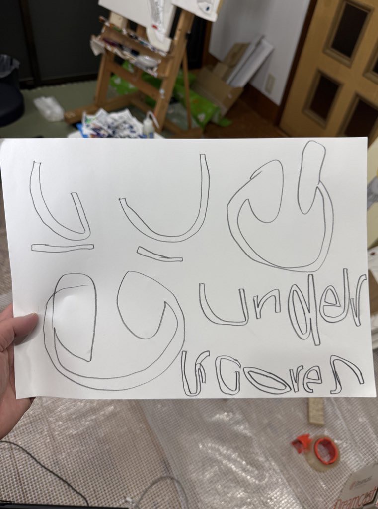
To appropriately capture her imagined version of the mall, Grey reached out to Japanese illustrator Ochiai Shohei. Shohei, who’s worked with Pharrell Williams’ JOOPITER and brands like New Era and Tamagotchi, reimagines household goods and childhood toys through a nostalgic lens in his drawings. Before the release of U, the pair had already collaborated on the single artworks for “Music,” “Do It,” and “Tell Me (U Want It),” creating a complete visual universe.
Ahead, Grey and Shohei talk through their collaboration and discuss chance introductions, romanticizing mall architecture, and the meticulous chaos behind the world of U.
 Courtesy of Ochiai Shohei
The FADER: Do you remember your first introduction to each other’s work? Was there anything that made you think, "I need to work with this person"?
April Harper Grey (underscores): I discovered Shohei’s work while I was making my album Wallsocket! I was immediately captivated by his art style – it's totally idiosyncratic, unlike anything I’d really seen from other artists. Actually, I think it was his illustration of GarageBand For Mac that I was initially obsessed with.
 Ochiai Shohei's drawing of GarageBand For Mac.
Courtesy of Ochiai Shohei
Ochiai Shohei's drawing of GarageBand For Mac.
Courtesy of Ochiai Shohei
Ochiai Shohei: I first heard about underscores through Kei from the Japanese band YONAWO. He told me, "There’s this really great artist you need to check out," and that was my introduction. When it comes to collaboration, I only want to work with people I genuinely find cool. With underscores, it wasn't just the music; it was April’s whole presence, attitude, and vibe. It felt incredibly compelling, and I instinctively knew I wanted to take the opportunity to work together.
How did you both connect for U? What were those early conversations like?
Grey: If memory serves, I think we actually reached out to Shohei to do something for Wallsocket, but we weren’t able to make it work! Looking back, I think it may have been a blessing in disguise, actually. Wallsocket felt more like a “painting” album to me – colors mixing and blurrier lines. U, my most recent album, fits Shohei’s art style a lot more.
Shohei: At first, I initially received a work request from underscores’ manager, but I had to decline it because of my schedule and because the motif was something I’d never attempted before. But I really wanted to create artwork for underscores, so I ended up DMing her directly on Instagram to apologize for declining. I told her, "Let’s definitely work together someday." She replied the same day, and from there, we just started talking occasionally. Eventually, that led to the offer to create the cover for the single “Music.”
 Courtesy of Ochiai Shohei
Was there a specific moment - an image, a lyric, or a conversation - where you both realized what kind of world the album cover should exist in visually?
Grey: I think of technology and modern architecture very romantically and I have since I was a child. Shohei’s illustrations of these kinds of technology and architecture feel very romantic to me, almost like drawing something you really love based on a cherished memory of it. I think the waviness of the lines and vibrance of the colors almost give his illustrations an air of childlike wonder. I was exploring this kind of world with U, so I thought it made sense to reach out when we were releasing the first single, "Music!" It’s been a joy to work with him – I look at the album on streaming and get really giddy looking at the cover art. I really appreciate his patience working on the U cover as well. We went back and forth and I had a lot of notes, haha.
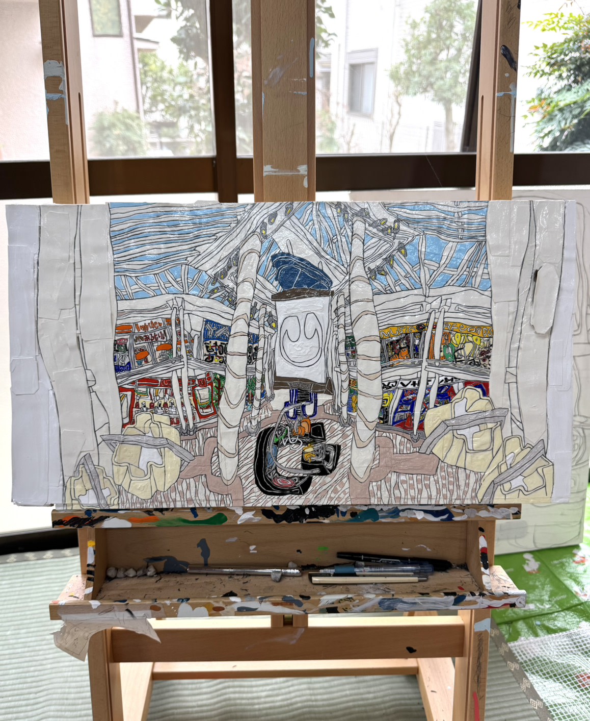
Shohei: For the two singles (“Music” and “DO IT”), underscores would propose a motif, and I was given complete freedom to create the artwork. Both were approved in one go! But for the album’s mall setting, the process was much more granular. Since the shops were fictional, we had these deep, detailed conversations. We weren't just sharing a vague vision; we were refining specific elements together – the color of the pillars, the shape of the headphone logo, the exact shade of the floor and the sky. We went through multiple revisions until we were fully satisfied. It felt less like sharing a concept and more like building a physical structure together: underscores was the designer, and I was the on-site director.
underscores was the designer, and I was the on-site director. —Ochiai Shohei


 Courtesy of Ochiai Shohei

How did you land on the shopping mall for the cover, and what did that space represent for you both?
Grey: I really like to tether all my albums to a real-life locations. It’ll be nice years later to look at a map with all of the different albums, and I like giving the fans someplace to make a pilgrimage to. For fishmonger, it was the smiley water tower in Longport, New Jersey. For Wallsocket, it was a horseshoe statue we fabricated in Ann Arbor. For U, because some of the album’s themes were city life, homesickness, and luxury, it felt right that this be my San Francisco album. It’s the city I was born and raised in.
I had gone to the Stonestown Galleria all my life. In high school, I had a ritual where I would walk from my house to the mall while listening to a specific album. It was very sacred to me. I started to become obsessed with the idea of the third album’s location being Stonestown Galleria. Shohei’s elaborate illustrations of the LUMINE EST shopping mall in Shinjuku and a Denny’s in Shibuya were the primary influences. Until the piece was done, I actually had his LUMINE EST illustration as the temporary cover art on the private link, haha!


Shohei: Inside the mall, I incorporated elements inspired by the track titles, as well as spaces like my favorite toy store and DVD shop. I wanted the piece to convey a sense of appeal I feel in underscores’ music – something that feels contemporary, yet also connected to the everyday moments and experiences we’ve all passed through in our lives. That quality of being somehow nostalgic while also feeling futuristic is, to me, a charm that also runs through all the product design.
Is there a small detail in the album cover that people might miss if they don't look closely?
Grey: I really love the guys working behind the counter at the sandwich place.
Shohei: One detail I personally like is the yellow headphones near the bottom center, which also became the cover for “Music.” When the artwork was released, some fans noticed it, which made me really happy!
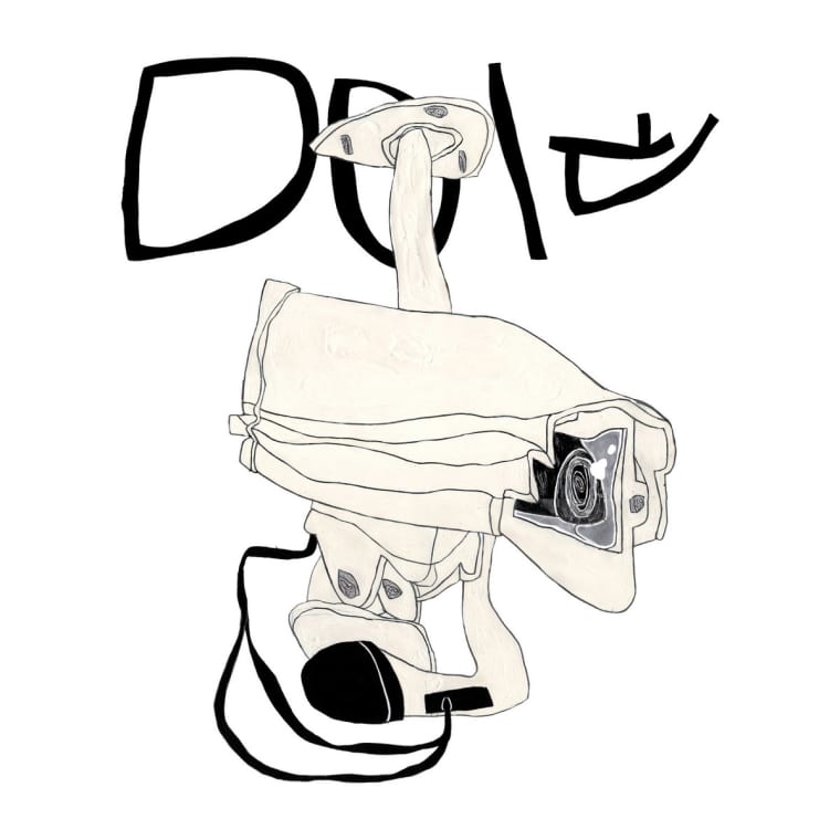
The single covers focus on specific objects: a plane, a security camera, headphones. How did you decide what item represented each song?
Grey: All the single cover artworks were items I felt represented the themes of the album as a whole! I loved the idea of having secondary illustrations that were part of the album packaging as well. This album in many ways is a push and pull between minimalism and maximalism, so having minimalist single covers and a maximalist album cover conveyed that well visually, I think.
 Ochiai Shohei
 Ochiai Shohei
If someone steps into the world of this album through the artwork, what’s the feeling you hope they notice?
Shohei: I want to create works that evoke a sense of warmth. I read an interview with underscores where she said the same thing, and I was very happy. I hope this artwork can bring even a little bit of warmth to those who see it. I hope it offers a sense of satisfaction to people who are no longer fulfilled by more conventional approaches. Through this album, I hope it enriches people’s lives.
Grey: I think a lot of other people find romanticism in unconventional places and objects. I’d hope those people can find a similar warmth in Ochiai’s artwork for this project.